- Jun 4, 2004
- 5,346
- 12,398
Away = Nice. Home = Horseshit.
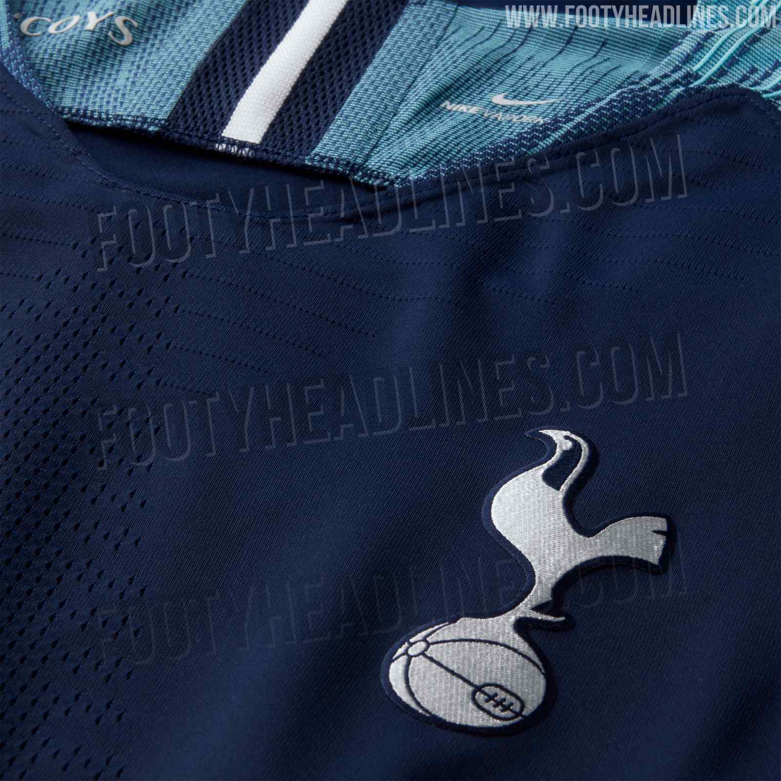
We're going to look ridiculous wearing the homes in Champions League.
Yank, I know you're a bit of a......negative nelly but come on dude, you've not even seen the shorts for the home kit yet so how can you possibly say we'll look ridiculous until then.
I feel pretty confident that the design team at Nike will be well aware of the potential pitfalls of the fade from the bottom of the shirt and how that could look if we have solid Navy shorts.
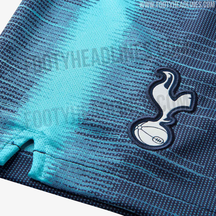
I reckon there's a good chance that the fade is replicated from the bottom of the shorts which would negate the whole Simon Cowell waist because there would be white in between, if that makes sense.