What's new

New Stadium Details And Discussions

EighteenEightyTwo

Well-Known Member
Jan 10, 2011
444
1,925
I have to say, this site is really weird for people who persist with weak arguments that have no factual basis... I don't know why it's hard to say "That's strange, maybe there's something into that" instead of "I'll argue against this one for no observational or factualy supported reason at all..."


It absolutely is. I have no idea what you do for work, but I can only guess and hope it has nothing to do with branding.

'Branding' covers pretty much every visual aspect of information or products associated with a brand or company. This even extends to templates for PowerPoint slides. Pretty much every respectable company will have a document outlining the 'brand', which will include what colours can and can't be used, the presentation of headings and text on print and screen materials and, more importantly here, the typefaces that can be used (in conjunction with how they are to be used).

'Branding' absolutely and unequivocally covers every visual aspect of a website.


n2ygCxC.gif


This is from the start of June:
'
View attachment 39325


C5rU85BWcAcGjDc.jpg


spurs_screen.png


0e0a3044fb72a9872a4360260b3027f8.jpg

The 'Spurs' font appears to be completely missing from every aspect of the site now, where previously it was on every page as part of headings, news items and so on. There's a noticeable difference between the main site, and the shop (which hasn't yet been "revamped").


I don't know why you keep banging on about "signs for the gents", which have been in no photos or mentioned by anyone except you.
Pretty much all the signage around WHL (exceptions being the older and larger signage that existed pre-ENIC) had the Spurs font, e.g.

images

(ignore the chav in the photo, it's from google)

None of the photos so far have this, it's a different typeface. It might change, but so far I've not seen the current "branding" inside the stadium, only on the "To dare is to do" outside bits.


I mean, I thought this was interesting as it suggests that quite a big part of the club's visual identity might be being phased out and potentially changing.
Spurs brand guidelines encourage the use of both ‘Spurs’ and Apex New fonts, but I have noticed the latter being used more frequently recently.
 

nicdic

Official SC Padre
Admin
May 8, 2005
41,857
25,920
Spurs brand guidelines encourage the use of both ‘Spurs’ and Apex New fonts, but I have noticed the latter being used more frequently recently.
Would be a good move considering how ugly the Spurs font is. Kills me when we use it on our shirts in Europe.
 

Suttonman

New Member
Jun 14, 2018
13
17
I have to say, this site is really weird for people who persist with weak arguments that have no factual basis... I don't know why it's hard to say "That's strange, maybe there's something into that" instead of "I'll argue against this one for no observational or factualy supported reason at all..."


It absolutely is. I have no idea what you do for work, but I can only guess and hope it has nothing to do with branding.

'Branding' covers pretty much every visual aspect of information or products associated with a brand or company. This even extends to templates for PowerPoint slides. Pretty much every respectable company will have a document outlining the 'brand', which will include what colours can and can't be used, the presentation of headings and text on print and screen materials and, more importantly here, the typefaces that can be used (in conjunction with how they are to be used).

'Branding' absolutely and unequivocally covers every visual aspect of a website.


n2ygCxC.gif


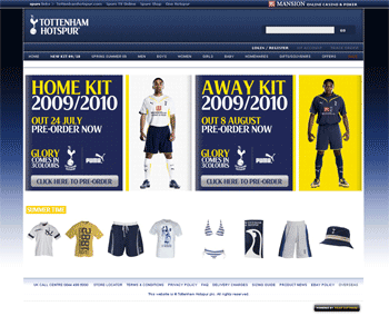
This is from the start of June:
'
View attachment 39325

C5rU85BWcAcGjDc.jpg


spurs_screen.png


0e0a3044fb72a9872a4360260b3027f8.jpg

The 'Spurs' font appears to be completely missing from every aspect of the site now, where previously it was on every page as part of headings, news items and so on. There's a noticeable difference between the main site, and the shop (which hasn't yet been "revamped").


I don't know why you keep banging on about "signs for the gents", which have been in no photos or mentioned by anyone except you.
Pretty much all the signage around WHL (exceptions being the older and larger signage that existed pre-ENIC) had the Spurs font, e.g.

images

(ignore the chav in the photo, it's from google)

None of the photos so far have this, it's a different typeface. It might change, but so far I've not seen the current "branding" inside the stadium, only on the "To dare is to do" outside bits.


I mean, I thought this was interesting as it suggests that quite a big part of the club's visual identity might be being phased out and potentially changing.
who the fork cares about what Font the club uses?
It certainly wasn't top of my reasons for becoming a spurs fan
 

dagraham

Well-Known Member
Sep 20, 2005
19,128
46,117
The only branding that concerns me is the East Stand and whether it will be as Spurs focused as the other stands, bearing in mind the constant reminder of it being associated with the NFL.

I don’t care about NFL, but as long as during my time attending Spurs games it doesn’t feel like a shared stadium when I’m there I’m not bothered. They can use any font they like ( as long as it’s not red and white ).
 

Suttonman

New Member
Jun 14, 2018
13
17
Why click on, read and reply to a thread called "New stadium details and discussion" then? :facepalm:
Because I’m interested in the stadium build, it’s progress and new features. I suspect there will be very few members here interested in or care about the font used by the club.
 
May 17, 2018
11,872
47,993
Because I’m interested in the stadium build, it’s progress and new features. I suspect there will be very few members here interested in or care about the font used by the club.

You misunderstand - it's a thread about the details, and you're kicking up a stink because of one of those (arguable important, as it affects a lot) details.

It's not called "Stadium details and discussion as of interest to Suttonman". If there's something you aren't interested in, scroll past.
 

whitesocks

The past means nothing. This is a message for life
Jan 16, 2014
4,652
5,738
fYS3uTA.jpg


Looks like the sand layer is being put on by hand - I've not seen any machine, and I guess with the trays separated, they don't have an easy way to get a specialist bulldozer on the pitch area, and nor would they want to, until the trays are all locked together and sharing the loads.
Perhaps they could use horses - old tech meets new. That would help the grass grow ... And we if want the Queen to open the stadium then we'd have a much better chance if she had some horses to look at.
 

nickspurs

SC Supporter
May 13, 2005
1,608
1,389
Looks like the sand layer is being put on by hand - I've not seen any machine, and I guess with the trays separated, they don't have an easy way to get a specialist bulldozer on the pitch area, and nor would they want to, until the trays are all locked together and sharing the loads.
Perhaps they could use horses - old tech meets new. That would help the grass grow ... And we if want the Queen to open the stadium then we'd have a much better chance if she had some horses to look at.
The Queen? Cool. Need a chant though. “Queen Lizo, she’s a yiddo”?
 
Top