What's new

New Kit 2014-15

DaSpurs

Well-Known Member
Jan 20, 2013
11,816
13,655
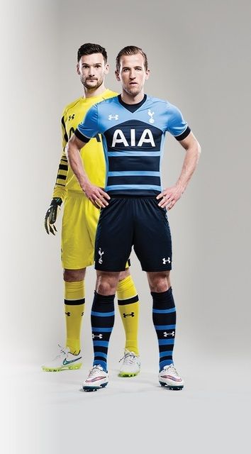
Aint it funny how opinions of a football shirt can differ so wildly. I guess it would be kinda boring otherwise.

For the record, those that don't like it.....you're all tacky and I hate you. I'm gonna wear it with pride, skipping down the road like a happy little school girl.

And if I see you I will lol very hard at you :)
 

Spurger King

can't smile without glue
Jul 22, 2008
43,881
95,149
Have we seen the third kit yet?

Supposedly this...

tottenham-hotspur-15-16-third-kit-1.jpg
 

yankspurs

Enic Out
Aug 22, 2013
41,970
71,397
Our kits would receive a massive upgrade if we did the right thing and scrapped them all to bring back the 13/14 kits.
 

spurs-r-us

Well-Known Member
Aug 21, 2008
2,219
3,031
Looks decent when worn, but would be even better without the weird arrow instead of a stripe.
 

guiltyparty

Well-Known Member
Sep 21, 2005
9,023
13,524
Don't agree with that at all. I think of our 'proper' away kit colour as being navy, sky blue or yellow (or purple at a push), and then with regard to the third kit, all bets are off. I LOVED the chocolate and gold third kit we had a few years back, it looked ugly as sin until you saw it on the team, and even then it was ruined somewhat by the clashing red Mansion logo, but it was handsome.

im5.jpg

"Chocolate"

Love how that PR term stuck. It's "Poo brown" and you know it ;-)

I really liked the recent black away kit
 

Sweech

Ruh Roh Ressegnon
Jun 27, 2013
6,752
16,378
I really like the home and the 3rd kit. Might actually get both.

3rd with Eriksen and home with Alderweireld (gonna hold off to see how he works out).
 

TwanYid

Well-Known Member
Aug 1, 2013
1,223
3,484
It's so fucking simple: for the second year in a row, the template for our third kit is precisely what should be done for our away kit, just switching the purple (this season) or yellow (last season) to NAVY FUCKING BLUE (with the "AIA" in white, obviously). Is it that hard?

Picture this season's third kit in NAVY. Not purple, but navy. It would sell like no other Spurs shirt in history.

But no- this being Spurs (and UA), there's gotta be something amiss. Yes, the purple top is beautiful-- but it's purple. As such, it's a novelty shirt. It could be green, orange, pink- whatever- it's not our color.

When they get the color right, they get the design wrong, and when they get the design right, they get the color wrong. They never check all the boxes- yet people on here with basic Photoshop skills somehow seem to be able to! Literally: I've seen kits I'd buy in a New York second designed by some random bloke on SC who "gets it."

It's not that hard. Once again: solid, navy blue top (no stripes, chevrons and/or other naff patterns), sponsors logo in white- job done. Our navy "HP" kit from two seasons ago came the closest to perfection, but hey- this is Spurs we're talking about- so obviously they had to add the gingham pattern on the shoulders. I could see the conversation in the drawing room at UA headquarters:

"It's perfect!"

"Hmmm...yes...exactly- and obviously we can't have that...at least throw something hideous on it- make it clash a bit- otherwise it'll look too nice, and everyone'll absolutely love it. Which would be awful."

"Uh- ok- how 'bout, maybe, a light-blue checkerboard pattern on the shoulders? That'll uglify it a bit..."

"NOW you're thinking like a true Tottenham kit designer! Great idea! Way to mess up perfection! Yup- let's go with that!"

This year's version of that is making the ultimate Tottenham shirt- in purple.

So fucking Spursy I could scream.
 
Last edited:

nicdic

Official SC Padre
Admin
May 8, 2005
41,857
25,920
It's so fucking simple: for the second year in a row, the template for our third kit is precisely what should be done for our away kit, just switching the purple (this season) or yellow (last season) to NAVY FUCKING BLUE (with the "AIA" in white, obviously). Is it that hard?

Picture this season's third kit in NAVY. Not purple, but navy. It would sell like no other Spurs shirt in history.

But no- this being Spurs (and UA), there's gotta be something amiss. Yes, the purple top is beautiful-- but it's purple. As such, it's a novelty shirt. It could be green, orange, pink- whatever- it's not our color.

When they get the color right, they get the design wrong, and when they get the design right, they get the color wrong. They never check all the boxes- yet people on here with basic Photoshop skills somehow seem to be able to! Literally: I've seen kits I'd buy in a New York second designed by some random bloke on SC who "gets it."

It's not that hard. Once again: solid, navy blue top (no stripes, chevrons and/or other naff patterns), sponsors logo in white- job done. Our navy "HP" kit from two seasons ago came the closest to perfection, but hey- this is Spurs we're talking about- so obviously they had to add the gingham pattern on the shoulders. I could see the conversation in the drawing room at UA headquarters:

"It's perfect!"

"Hmmm...yes...exactly- and obviously we can't have that...at least throw something hideous on it- make it clash a bit- otherwise it'll look too nice, and everyone'll absolutely love it. Which would be awful."

"Uh- ok- how 'bout, maybe, a light-blue checkerboard pattern on the shoulders? That'll uglify it a bit..."

"NOW you're thinking like a true Tottenham kit designer! Great idea! Way to mess up perfection! Yup- let's go with that!"

This year's version of that is making the ultimate Tottenham shirt- in purple.

So fucking Spursy I could scream.
We have had quite a few purple kits, it is a Spurs colour.

We have a number of colours that are in regular rotation for away/third shirt (navy, light blue, yellow, purple) and black has been thrown in recently on occasion too.

I really like all of the kits. Design is subjective so stop harping on as if you are the voice on Spurs kits.

We'd also have exactly the same kind of problem if we were given a plain design each year. People would moan that they aren't paying x for a plain t shirt or polo shirt.

If you don't like them don't buy them, you really don't need to go on and on about it. It's not that big a deal.
 

Yid-ol

Just-outside Edinburgh
Jan 16, 2006
31,164
19,416
It's so fucking simple: for the second year in a row, the template for our third kit is precisely what should be done for our away kit, just switching the purple (this season) or yellow (last season) to NAVY FUCKING BLUE (with the "AIA" in white, obviously). Is it that hard?

Picture this season's third kit in NAVY. Not purple, but navy. It would sell like no other Spurs shirt in history.

But no- this being Spurs (and UA), there's gotta be something amiss. Yes, the purple top is beautiful-- but it's purple. As such, it's a novelty shirt. It could be green, orange, pink- whatever- it's not our color.

When they get the color right, they get the design wrong, and when they get the design right, they get the color wrong. They never check all the boxes- yet people on here with basic Photoshop skills somehow seem to be able to! Literally: I've seen kits I'd buy in a New York second designed by some random bloke on SC who "gets it."

It's not that hard. Once again: solid, navy blue top (no stripes, chevrons and/or other naff patterns), sponsors logo in white- job done. Our navy "HP" kit from two seasons ago came the closest to perfection, but hey- this is Spurs we're talking about- so obviously they had to add the gingham pattern on the shoulders. I could see the conversation in the drawing room at UA headquarters:

"It's perfect!"

"Hmmm...yes...exactly- and obviously we can't have that...at least throw something hideous on it- make it clash a bit- otherwise it'll look too nice, and everyone'll absolutely love it. Which would be awful."

"Uh- ok- how 'bout, maybe, a light-blue checkerboard pattern on the shoulders? That'll uglify it a bit..."

"NOW you're thinking like a true Tottenham kit designer! Great idea! Way to mess up perfection! Yup- let's go with that!"

This year's version of that is making the ultimate Tottenham shirt- in purple.

So fucking Spursy I could scream.
"it's not our colour"

Maybe you should go brush up on kit history, here is a link to help you.

http://www.historicalkits.co.uk/Tottenham_Hotspur/Tottenham_Hotspur-change-kits.html

If we want "our colour" then really a brown or mustard colour were our original ones, and even before a full navy kit, we had red.
 

Rocksuperstar

Isn't this fun? Isn't fun the best thing to have?
Jun 6, 2005
53,372
67,023
Lets not go over the whole brown shirt thing again. Doesn't matter what you do with it, it'll always be brown. :wtf:
 

guiltyparty

Well-Known Member
Sep 21, 2005
9,023
13,524
It's so fucking simple: for the second year in a row, the template for our third kit is precisely what should be done for our away kit, just switching the purple (this season) or yellow (last season) to NAVY FUCKING BLUE (with the "AIA" in white, obviously). Is it that hard?

Picture this season's third kit in NAVY. Not purple, but navy. It would sell like no other Spurs shirt in history.

But no- this being Spurs (and UA), there's gotta be something amiss. Yes, the purple top is beautiful-- but it's purple. As such, it's a novelty shirt. It could be green, orange, pink- whatever- it's not our color.

When they get the color right, they get the design wrong, and when they get the design right, they get the color wrong. They never check all the boxes- yet people on here with basic Photoshop skills somehow seem to be able to! Literally: I've seen kits I'd buy in a New York second designed by some random bloke on SC who "gets it."

It's not that hard. Once again: solid, navy blue top (no stripes, chevrons and/or other naff patterns), sponsors logo in white- job done. Our navy "HP" kit from two seasons ago came the closest to perfection, but hey- this is Spurs we're talking about- so obviously they had to add the gingham pattern on the shoulders. I could see the conversation in the drawing room at UA headquarters:

"It's perfect!"

"Hmmm...yes...exactly- and obviously we can't have that...at least throw something hideous on it- make it clash a bit- otherwise it'll look too nice, and everyone'll absolutely love it. Which would be awful."

"Uh- ok- how 'bout, maybe, a light-blue checkerboard pattern on the shoulders? That'll uglify it a bit..."

"NOW you're thinking like a true Tottenham kit designer! Great idea! Way to mess up perfection! Yup- let's go with that!"

This year's version of that is making the ultimate Tottenham shirt- in purple.

So fucking Spursy I could scream.

I've posted on this before. Stats back up why they do what they do. You are quite understandably thinking like a fan and not someone trying to flog kits.

They need to hit key demographics with each kit, it's all considered and strategic. There seems to be three key areas they're trying to hit: hardcore fans, casuals, international. And the home, for us, has seemed increasingly not aimed at the hardcore fans. I guess they assume hardcore fans will buy it, whatever it looks like, while the casuals/non-knowers need a bit more help with their wallet.

Think of it as the fashion equivalent of 20/20 cricket. How can we shave the edges off and make it more immediate to get people interested. What baubles are popular? Colourful kits! Music when someone gets a six! Much shorter duration please!

The overarching theme of these new ones, I would say, is they're aimed at US market, which would tie with NFL deal, Yedlin etc. The US loves go-faster stripes - look at DC United, Dallas, Chicago Fire http://www.kitbag.com/stores/kitbag/en/c/football/football-kits/american-clubs/mls
http://i.imgur.com/mCpQOQc.png

Oh, hello LA Galaxy, most marketable MLS team:

Screen Shot 2015-07-19 at 11.12.19.png


And hello Kansas City second kit:

Screen Shot 2015-07-19 at 11.14.47.png


Last one looked aimed at Asia - mandarin collar, yellow prominence - which tied in with AIA sponsorship.

Screen Shot 2015-07-19 at 11.13.13.png

While the yellow away one was to please fans, classic, reminiscent of classic kits, not much detail. While the black away was for a younger/casual crowd.

We've had loads of purple kits, I'd say it's a recognisably Spurs colour – Umbro, Pony, Kappa and Puma all did purple/heavily purple detailed ones, I would argue it's become a regular third-kit possibility, since such a thing was introduced: http://www.historicalkits.co.uk/Tottenham_Hotspur/Tottenham_Hotspur-change-kits.html.

I actually think the purple one, if it turns out to be that, will be meant to be this year's fan-pleaser (which ties in with pretty much everyone on here saying they love it), while the blue is for the younger crowd, and the home is again to attempt to widen market.

One of my favourite kits ever, of all colours:

Screen Shot 2015-07-19 at 11.09.33.png
 
Last edited:
Top