- Jan 10, 2011
- 445
- 1,929
Spurs brand guidelines encourage the use of both ‘Spurs’ and Apex New fonts, but I have noticed the latter being used more frequently recently.I have to say, this site is really weird for people who persist with weak arguments that have no factual basis... I don't know why it's hard to say "That's strange, maybe there's something into that" instead of "I'll argue against this one for no observational or factualy supported reason at all..."
It absolutely is. I have no idea what you do for work, but I can only guess and hope it has nothing to do with branding.
'Branding' covers pretty much every visual aspect of information or products associated with a brand or company. This even extends to templates for PowerPoint slides. Pretty much every respectable company will have a document outlining the 'brand', which will include what colours can and can't be used, the presentation of headings and text on print and screen materials and, more importantly here, the typefaces that can be used (in conjunction with how they are to be used).
'Branding' absolutely and unequivocally covers every visual aspect of a website.

This is from the start of June:
'
View attachment 39325

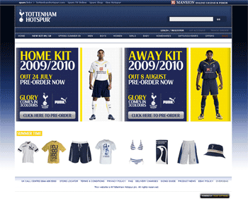

The 'Spurs' font appears to be completely missing from every aspect of the site now, where previously it was on every page as part of headings, news items and so on. There's a noticeable difference between the main site, and the shop (which hasn't yet been "revamped").
I don't know why you keep banging on about "signs for the gents", which have been in no photos or mentioned by anyone except you.
Pretty much all the signage around WHL (exceptions being the older and larger signage that existed pre-ENIC) had the Spurs font, e.g.

(ignore the chav in the photo, it's from google)
None of the photos so far have this, it's a different typeface. It might change, but so far I've not seen the current "branding" inside the stadium, only on the "To dare is to do" outside bits.
I mean, I thought this was interesting as it suggests that quite a big part of the club's visual identity might be being phased out and potentially changing.