What's new

2013/14 kit release....d

Revan1882

Well-Known Member
Jun 5, 2013
840
464
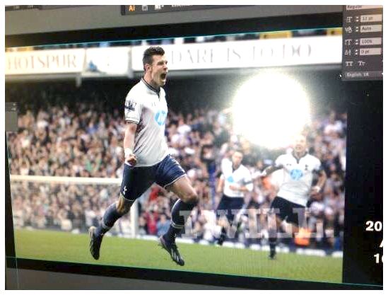
its the slogan they are using this season
https://twitter.com/SpursOfficial

but i do agree it looks strange having it on the photo and not the screen

I guess we just have till Monday, but I wouldn't have to much of an issue with this kit. Was hoping the logo would look better though.

Just wish I could rotate the image so we could see it head on as the I WILL could just be at an odd angle, but not sure something seems off.
 

Grapo2001

Well-Known Member
Jul 26, 2011
3,700
5,957
HP always change the shade of the logo. On the keyboard I'm using its black, on the computer it's silver. Wish we had pushed to make it navy, but I'm sure it came down to money and they would pay more to have it in their corporate light blue.
 

edgey

Well-Known Member
May 16, 2013
2,922
2,993
We should hopefully have a leak either today or tomorrow if the rumours are true that Paulinho is in London and will be snapped in the new kit.

Also "I WILL" is UA's slogan that they have been using this year with all their sporting outlets not just Spurs
 

Nick

Well-Known Member
Jul 18, 2004
1,288
563
BOWeIysCcAAzsfO.jpg:large


I like it, hope it's real.
 

Revan1882

Well-Known Member
Jun 5, 2013
840
464
Was messing around just to see if the I WILL is on the screen or added later, I have used a similar font (can't be bothered to find the real one) and used the picture they used. I am not good at this but I used the angle that Twitter were using and came up with this.....


removed copyright image

Just thought it would be worth comparing to see if the I WILL is a screen issue or just at an odd angle. I still think it's an screen thing.
 

chrissivad

Staff
May 20, 2005
51,646
58,072
Was messing around just to see if the I WILL is on the screen or added later, I have used a similar font (can't be bothered to find the real one) and used the picture they used. I am not good at this but I used the angle that Twitter were using and came up with this.....


removed copyright image

Just thought it would be worth comparing to see if the I WILL is a screen issue or just at an odd angle. I still think it's an screen thing.


cant post copyright images i am afraid.

I wouldnt mind it as our kit though, and out of the ones we have seen in the last week this looks more real than the others
 

Cavehillspur

Well-Known Member
Jan 28, 2011
14,122
18,502
HP always change the shade of the logo. On the keyboard I'm using its black, on the computer it's silver. Wish we had pushed to make it navy, but I'm sure it came down to money and they would pay more to have it in their corporate light blue.

I hadnt even realised until now that I am using a HP PC in work lol Logo colours same as you have described too.
 

Rocksuperstar

Isn't this fun? Isn't fun the best thing to have?
Jun 6, 2005
53,430
67,174
The officials use a better quality material, are more light weight and fit tighter to the skin


And the match kits would look a lot less flattering stretched over a seasons worth of pre-match booze too - the replicas are a little more... generous in their cut.
 

chrissivad

Staff
May 20, 2005
51,646
58,072
HP always change the shade of the logo. On the keyboard I'm using its black, on the computer it's silver. Wish we had pushed to make it navy, but I'm sure it came down to money and they would pay more to have it in their corporate light blue.


I hadnt even realised until now that I am using a HP PC in work lol Logo colours same as you have described too.

how old are they?
They have only recently changed their logo to the circle one with the lighter blue, but do use white and back on products as well.

i posted this a while back regarding their new brand

4df4240ea93373ad7f1878fd3da3a356.jpg
 

Phischy

The Spursy One
Feb 29, 2004
1,000
1,152
The 'I WILL' is always at an angle in UA promo stuff and always on the bottom right. You'll have seen it on the billboards outside WHL. The reason it looks superimposed on the picture instead of on the computer screen is the picture angle makes the 'I WILL' look straight, giving it the impression of popping out of the frame on to the picture itself.

We had Autonomy and Aurasma photoshopped onto blank kits to begin with and the THFC staff did a scarily amateur job of it, to the point I would have questioned the picture authenticity had it not come from the club themselves. (Angles were poor, sizing and location varied between shirts) but it may have been a rush job down to last minute deals.

In terms of the HP logo, it seems agreed that HP will be the new sponsor, that's not in dispute. Earlier in this thread someone posted HP's branding rules for their logo. They specify in that they want to toughen their stance on its use. The primary colour is that bright royal blue on white with black and grey in the secondary palette and then a tertiary palette with three bright shade in it, purple, yellow and one other i think. On hardware it's a bit different and I think that's where the silver and black come in, but they are trying to strengthen their brand and I have no doubt this will have been a deal breaker when it comes to sponsoring the club and that's why we see the bright blue on our new shirt.

Finally, the quality of the photoshop is excellent, really professional and very much in line with the current trend for action shots of players in new shirts, which can only really be achieved by photoshopping.

To me this is a clear case of someone in UA working on the promo stuff and leaking a picture of what they are working on. (Or a colleague doing so whilst they've left their desk!) That explains the photoshop bits on the screen. Someone doing mock ups just wouldn't have the time or skill to be doing that level of design work (at least it's unlikely) or they'd be working in the industry themselves.

I am 99% sure we are looking at genuine promo work on our next home kit.
 

thfc1989

Well-Known Member
May 8, 2008
2,604
3,455
Pretty convinced this is real. The players photoshopped in and the slogan seem in line with previous marketing initiatives
 

edgey

Well-Known Member
May 16, 2013
2,922
2,993
Well of all the mock ups it's the most believable. As others have said, NIKE usually photo shop for "action" promo. Plus the fact they added 2 players in the background to the original image makes it more likely to be a promo pic.

original

Hope it's real as it's much better than the chevron efforts. I'm not overly keen on the light blue logo but the kit itself is stylish... Who knows we could extend our Investec deal for cup comps so I would get that.
 

chrissivad

Staff
May 20, 2005
51,646
58,072
will people stop posting copyright images...

also i hope thats not the promo image they are going with.
1 man team.... other players faded into the background....
 

Spurrific

Well-Known Member
Jun 2, 2011
13,501
57,356
Now I'm pretty certain we're looking at the real home kit, and I really like it. Looking forward to seeing the away and third kit now if they're up to the same standard.
 

Ghost Hardware

Well-Known Member
Aug 31, 2012
18,701
64,838
Did we get some ITK a while back saying there would be 4 kits this season? Or am making it up... And regardless will all be unveiled on Monday or just the home kit?
 

Revan1882

Well-Known Member
Jun 5, 2013
840
464
cant post copyright images i am afraid.

I wouldnt mind it as our kit though, and out of the ones we have seen in the last week this looks more real than the others

I would hope for a little more detailing, but if its real it might not a great picture.
 
Top