

You are using an out of date browser. It may not display this or other websites correctly.
You should upgrade or use an alternative browser.
You should upgrade or use an alternative browser.
New Home Kits - 2021/22
- Thread starter freeeki
- Start date

- May 20, 2005
- 51,646
- 58,072
- Staff
- #3
Nothing offensive about it.
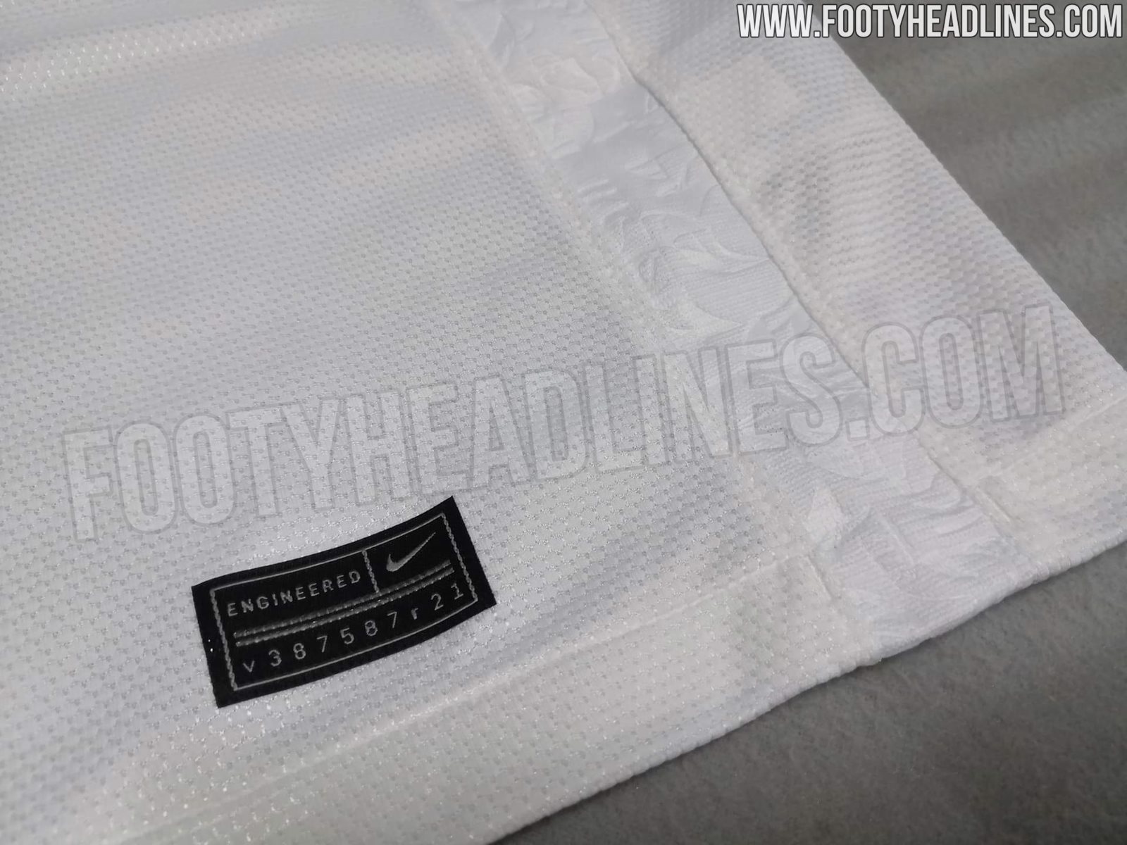
But what's with the badge on the inside?
But what's with the badge on the inside?
- Aug 5, 2008
- 11,840
- 69,469
- Thread starter
- #4
Nothing offensive about it.
But what's with the badge on the inside?
That’s for... people who wear it inside out.
Saves on washing.
- Sep 2, 2013
- 15,170
- 72,170
That’s for... people who wear it inside out.
Saves on washing.
- Jun 30, 2020
- 2,027
- 11,165
Some saying these are “too simple”, personally I think they’re perfect if they’re the real deal.
‘Twas ever thus.....produce a busy design and you’ll get fans asking how it is possible to make a simple, white shirt look so bad; produce a simple design and you’ll get fans asking why they should pay so much when they could just as easily get a plain white t shirt for a quarter of the price.
- Aug 31, 2012
- 4,007
- 10,523
personally think it would look better with a navy cuff
- Aug 5, 2008
- 11,840
- 69,469
- Thread starter
- #12
I hope it's white socks and not navy blue
It is apparently navy blue socks
- Aug 20, 2013
- 12
- 32
I like the clean look, but still there's a couple of things I don't like. Lets hope this is not real.
- The collar shape looks ok but the material looks sloppy
- Why doesn't it have the vaporknit 21-22 design instead of this old man polo shirt texture (looks like the elite version based on the swosh and logo)
- The pattern on the sides; what's the story behind this? It doesn't fit the texture of the jersey or the collar.
There is again too much details not matching together. Impressive on a clean white shirt.
- Nov 29, 2004
- 36,269
- 115,356
It is apparently navy blue socks
I know, hope it's wrong.
- Jun 30, 2020
- 2,027
- 11,165
I like the clean look, but still there's a couple of things I don't like. Lets hope this is not real.
- The collar shape looks ok but the material looks sloppy
- Why doesn't it have the vaporknit 21-22 design instead of this old man polo shirt texture (looks like the elite version based on the swosh and logo)
- The pattern on the sides; what's the story behind this? It doesn't fit the texture of the jersey or the collar.
There is again too much details not matching together. Impressive on a clean white shirt.
The details you mention won’t be noticeable other than from close up.
And the reason why such details are added is to make it more difficult for knockoff versions (of which there will be many) to be mistaken for the real thing - especially important on otherwise simple designs. Each of these details makes the production process more complicated and more expensive for the knockoff manufacturers.
- Jul 1, 2008
- 12,270
- 38,973
Fair play, must've taken them fucking ages to come up with that
- Aug 2, 2004
- 4,773
- 9,164
- Jun 21, 2008
- 3,803
- 6,913
It's clearly based on the 1961 kit so it surely should be navy socks.It is apparently navy blue socks
- Jun 21, 2008
- 3,803
- 6,913
That is still the shirt I wear to this day. Love it.
Similar threads
- Replies
- 34
- Views
- 2K
- Replies
- 3
- Views
- 933