- Jan 7, 2007
- 6,075
- 4,243
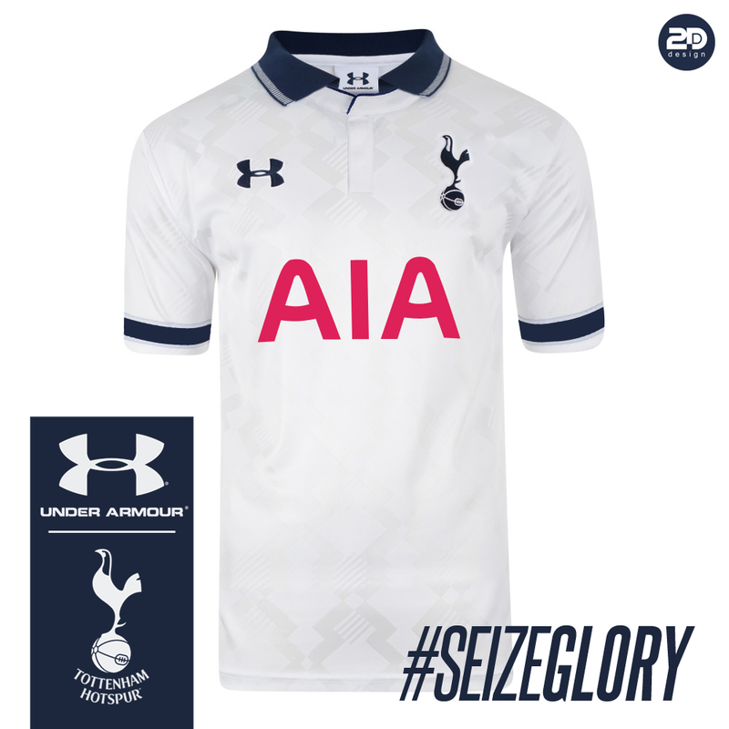
That's a photoshop of the England 1990 Umbro WC kit.....

That's a photoshop of the England 1990 Umbro WC kit.....
Reminds me of the 91 fa cup shirt.That reminds me of the England Kit from Italia 90

I can't wear that shirt, it has red on it.
So you didn't buy any shirts in '83-'95 & '97-'06 when the crest itself encompassed two read lions? Or how about the all-red shirts in the 1930's?I can't wear that shirt, it has red on it.
That's because it is that kit. The background pattern woven into the shirt gives it away.That reminds me of the England Kit from Italia 90
I don't buy any clothes with red it in, nothing at all.So you didn't buy any shirts in '83-'95 & '97-'06 when the crest itself encompassed two read lions? Or how about the all-red shirts in the 1930's?
Maybe you should start. I fear you are jinxing it for the rest of usI don't buy any clothes with red it in, nothing at all.

I don't buy any clothes with red it in, nothing at all.
More to do with bad experiences like these.Started with
I'm assuming you had a bad experience as a bullfighter?
Oh, and yes I edited the England 1990 shirt
What's absurd is that you think a company is going to change it's company logo to suit us. I also doubt that Daniel Levy gives a damn about having a bit of red on a shirt. The never red thing is completely exagerated anyway.Ohhhh I see what you're saying now. I agree with that entirely also. I cant fucking stand the AIA logo being red. You're sponsoring a club whose color's are blue and white and whose rivals color's are red and white. Let us use a blue sponsor logo.
Also is nuts that some shirts have a white background for the sponsor logo. It's absurd.
I have an issue with the color red being so glaring. Not just due to those fuck heads from woolwich. The city of boston has ALOT to due to with it also. Fucking hate everything about those shit stain red sox. Also despise those fucking inbreds from columbus, ohioWhat's absurd is that you think a company is going to change it's company logo to suit us. I also doubt that Daniel Levy gives a damn about having a bit of red on a shirt. The never red thing is completely exagerated anyway.
I agree, but if it's the blue mountain AIA logo then it works because there is a nice artistic/visual element to it.That shirt is awesome, and the one with the red logo is best.
I think just two colours makes the shirt look a bit bland and boring.
I agree, but if it's the blue mountain AIA logo then it works because there is a nice artistic/visual element to it.
For next season, I think they should make a cleaner version of this season's kits. The home kit without the yellow, and a neater collar, the away kit with a cleaner blue colour and no pattern, and the yellow kit exactly as they made the yellow training kit for this season. In short, simplify the present kits, and they will be fine.
like the 2014 World Cup french kitCouldn't give a shit if the sponsor is red to be honest, unless it really detracts from the appearance of the shirt.
Would love a set of kits that resemble Under Armour's first set with us, they've been my favourite set of kits for years, I still look for the away one which I didn't buy at the time.
A plain navy blue away shirt with a proper white collar is what I would really love though.

like the 2014 World Cup french kit