
- Jun 26, 2013
- 175
- 606
Filth

I don't even think this shirt will be a "grower", it's just nasty and that wonky collar does my head in.Taupe shirt looking pretty sexy now isn't it lads!
This looks like someone tried to print out a Man City shirt but the toner is less low, but instead in some way cursed. Possibly the worst shirt in my living memory.
Really makes you wonder about...well, every single step of the design and approval process, frankly.
Agreed. It doesn't fit at all with some of the more "out there" kit sensibilities that we've seen over the past few years from us and others. It's genuinely just very, very bad design. It's not retro, nor has an eye on the future, or the now. It's not knowingly quirky and it's not calling back to anything from our past. AI could have and probably has done a better job. Not even a CL semi win is going to save this blighted top if it looks like this.I don't even think this shirt will be a "grower", it's just nasty and that wonky collar does my head in.
Just, why?
I know I'm old and my personal taste is a simple, clean shirt but I can get behind some of the wacky ones we've had.
This one is just an unbalanced, chaotic mess.
Yeah, I didn't like the Moura CL kit when it first came out but it grew on me, same with the home kit with the pale grey camo thing going on and the zig-zag/lightning bolts down the sides.Agreed. It doesn't fit at all with some of the more "out there" kit sensibilities that we've seen over the past few years from us and others. It's genuinely just very, very bad design. It's not retro, nor has an eye on the future, or the now. It's not knowingly quirky and it's not calling back to anything from our past. AI could have and probably has done a better job. Not even a CL semi win is going to save this blighted top if it looks like this.
Oh well! Hopefully the third kit this time isn't a loss generator.
Yes. Put the badge in the right place for fuck sake. Why do they make these changes which so obviously make the kit worse?Love it.....barring that badge in the centre. Should have been on the left. Could have been my most favorite Nike kit thus far. Pity about the badge in the centre.
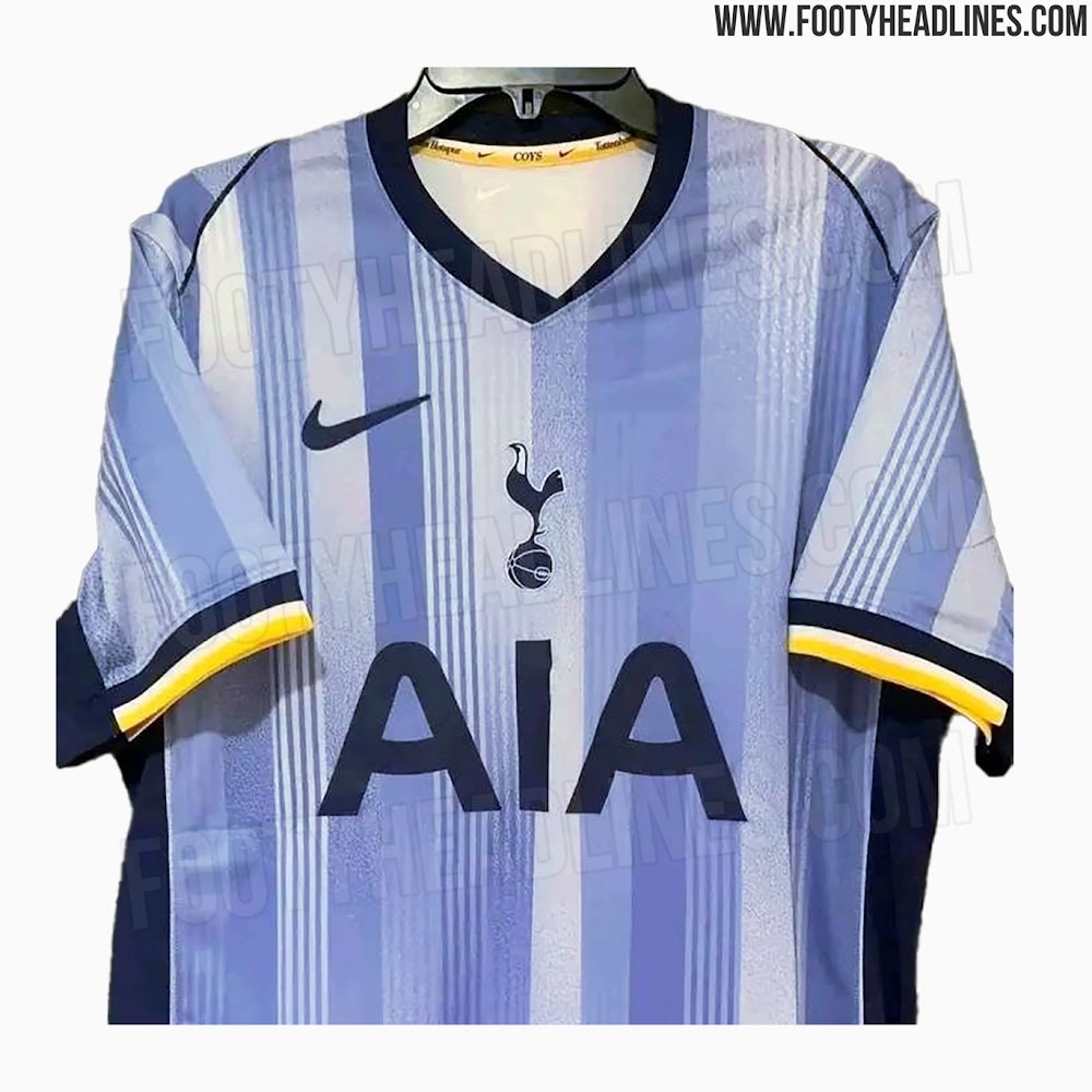
What the fuck is up with that lopsided v-neckExclusive: Tottenham 24-25 Away Kit Leaked
Update: We can leak the first two actual photos of the Tottenham 2024-25 away kit. It combines different shades of light blue with navy for applications, plus white & yellow detailing.

Our kits should be designed around those three colours on those sleeve ends. That part of the shirt is perfect. The rest 🫣Exclusive: Tottenham 24-25 Away Kit Leaked
Update: We can leak the first two actual photos of the Tottenham 2024-25 away kit. It combines different shades of light blue with navy for applications, plus white & yellow detailing.


I don't mind the V neck actually..... I often find the round neck a tad boring.What the fuck is up with that lopsided v-neck
I bet that's what it was initially and then they couldn't leave it alone and had to add more to it.Wow.
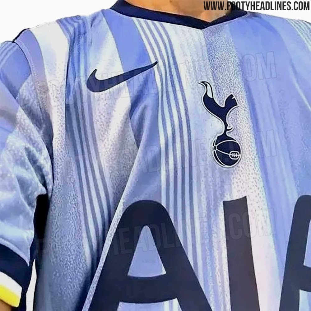
What a difference. First image, with crest in the centre, was beaut
That above is disgusting.
One side of the v neck looks thicker than the other though? Maybe its just creased in the photo lol Looks weird.I don't mind the V neck actually..... I often find the round neck a tad boring.
And the ‘V’ isn’t centered.One side of the v neck looks thicker than the other though? Maybe its just creased in the photo lol Looks weird.
 . It looks really unbalanced.
Looks like the curtains in my Nana's spare room...Exclusive: Tottenham 24-25 Away Kit Leaked
Update: We can leak the first two actual photos of the Tottenham 2024-25 away kit. It combines different shades of light blue with navy for applications, plus white & yellow detailing.
fucking hate that kit23/24 3rd Kit - "Hold my Taupe-colored Ale"
")