- Jan 9, 2014
- 14,914
- 26,616
Some perfected shit here. I already miss the fake #knowyourhistory campaign from last summer. The buzz fake kits can create, imagine if real...
No doubt, those are quite sharp. Always appreciate when kit designers take the sponsor and try to make the kit work around it, as it makes the sponsor look less absurd. This year with the home, it's as if UA were completely oblivious that the sponsor would be red. I mean how they could design that shirt and not think "shit, this is a Fisher Price toy" is beyond me.
Everything you say is of course true, but it baffles me that UA, surely knowing that the sponsor would be red, still throw both blue and yellow into the mix as well. Three colours on the white shirt is just messy as hell.There is unfortunately, very little that UA can do about it. Big companies have marketing strategies that dictate the colour of the text in the company branding when set against certain colour backgrounds. This is why the HP logo on last years home kit was in that strange sky blue, against the white/navy kit, which looked really odd in my opinion. AIA's branding strategy obviously dictates that when set against a white background, the company name/initials will appear in bright red text. Us adhering to their branding/marketing strategy would form part of the contract agreed with Spurs, and as they are giving us £m's every year, it's not unreasonable for them to ask us to adhere to those guidelines. Levy will have known this when he signed the dotted line, so if anyone has beef, they probably need to have beef with Daniel
There is unfortunately, very little that UA can do about it. Big companies have marketing strategies that dictate the colour of the text in the company branding when set against certain colour backgrounds. This is why the HP logo on last years home kit was in that strange sky blue, against the white/navy kit, which looked really odd in my opinion. AIA's branding strategy obviously dictates that when set against a white background, the company name/initials will appear in bright red text. Us adhering to their branding/marketing strategy would form part of the contract agreed with Spurs, and as they are giving us £m's every year, it's not unreasonable for them to ask us to adhere to those guidelines. Levy will have known this when he signed the dotted line, so if anyone has beef, they probably need to have beef with Daniel
Apparently the new West Ham kit will have velcro on it so they can swap over the sponsors as and when each deal spectacularly collapses....

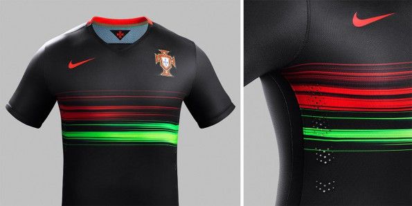
Portugal away

Logo looks a bit 3D-ishWolfsburg, that's almost a Beasties style chain (now that would be an ill design...)
)
)
The new Barcelona home shirt - horizontal stripes for the first time in the clubs history.
For me it doesn't look right.
)

The new Barcelona home shirt - horizontal stripes for the first time in the clubs history.
For me it doesn't look right.
)
Also the fact that there is more blue than red is also a bit jarring.The new Barcelona home shirt - horizontal stripes for the first time in the clubs history.
For me it doesn't look right.
)
Betis home and away
.jpg (Share from CM Browser))
.jpg (Share from CM Browser))
They will also have a plain blue 3rd shirt.How can they have a home and away kit that are both predominantly green?
)
What's with the weird extended sleeves on all 3 shirts ?They will also have a plain blue 3rd shirt.
)